Inline Images in Framer CMS Render at 600px. Here's the Fix.

If you import content into Framer's CMS from a CSV, paste markdown bodies into a rich-text field, or insert inline images via markdown image syntax, every one of those images will render at exactly 600 pixels wide on desktop. Smaller than your text column. Centered with whitespace on both sides regardless of how wide the article template was designed to be.
Framer hardcodes width="600" as an HTML attribute directly on the <img> tag. The constraint isn't a setting in the CMS, isn't documented in the editor, and isn't reachable through the visual controls. Inspect any inline image in DevTools and you'll see the attribute sitting there in the markup, narrowing every figure to the same fixed size regardless of your content column's real width.
The fix is one CSS rule in the CMS detail page's custom code. It overrides Framer's hardcoded width and lets every inline image fill the column. A second rule styles the figure captions underneath. The whole patch is under twenty lines of CSS, ships once at the template level, and applies to every article in the collection forever. This manual walks through the exact CSS, where to paste it, and how to verify it took.
The problem
Open any inline image in Framer's CMS preview in Chrome DevTools. You'll see something close to this in the Elements panel:
The width="600" is an HTML attribute, not a CSS declaration. Framer adds it during the render pass when its CMS converts markdown image syntax or CSV-imported image references into rendered <img> elements. The attribute is hardcoded. There's no setting in the CMS editor to change it, no per-image override accessible from the visual controls, and no way to clear it from the rich-text body without writing CSS.
The constraint creates a few problems at once:
1. The image is narrower than your content column. Most Framer article templates run a text column at 720px to 900px wide on desktop. A 600px image sitting inside an 800px column gets centered (or left-aligned, depending on the template) with whitespace on at least one side. The figure no longer carries the visual weight of the section it sits in.
2. The aspect ratio renders smaller than its source. A figure exported at 1200×760 will render at 600×380, half its native resolution. Detail in the figure (UI text, screenshot annotations, code in a code-editor mockup) loses readability at 600px, despite the source asset being sized to be legible at 1200px.
3. The mobile rendering is fine, which masks the problem in mobile-first design reviews. On a phone, 600px is wider than the viewport, so the image fills the column and looks correct. Designers who review only on mobile won't catch the desktop issue. The first complaint typically comes from a reader who opened the article on a laptop.
4. The CSS workaround can't live in the markdown body. Framer's markdown parser strips inline <style> blocks and unwhitelisted HTML attributes from the body content. If you try to add style="width:100%" to an <img> tag pasted into the body, the style attribute disappears at render time. The override has to live somewhere Framer doesn't sanitize. The detail-page custom code section is that place.
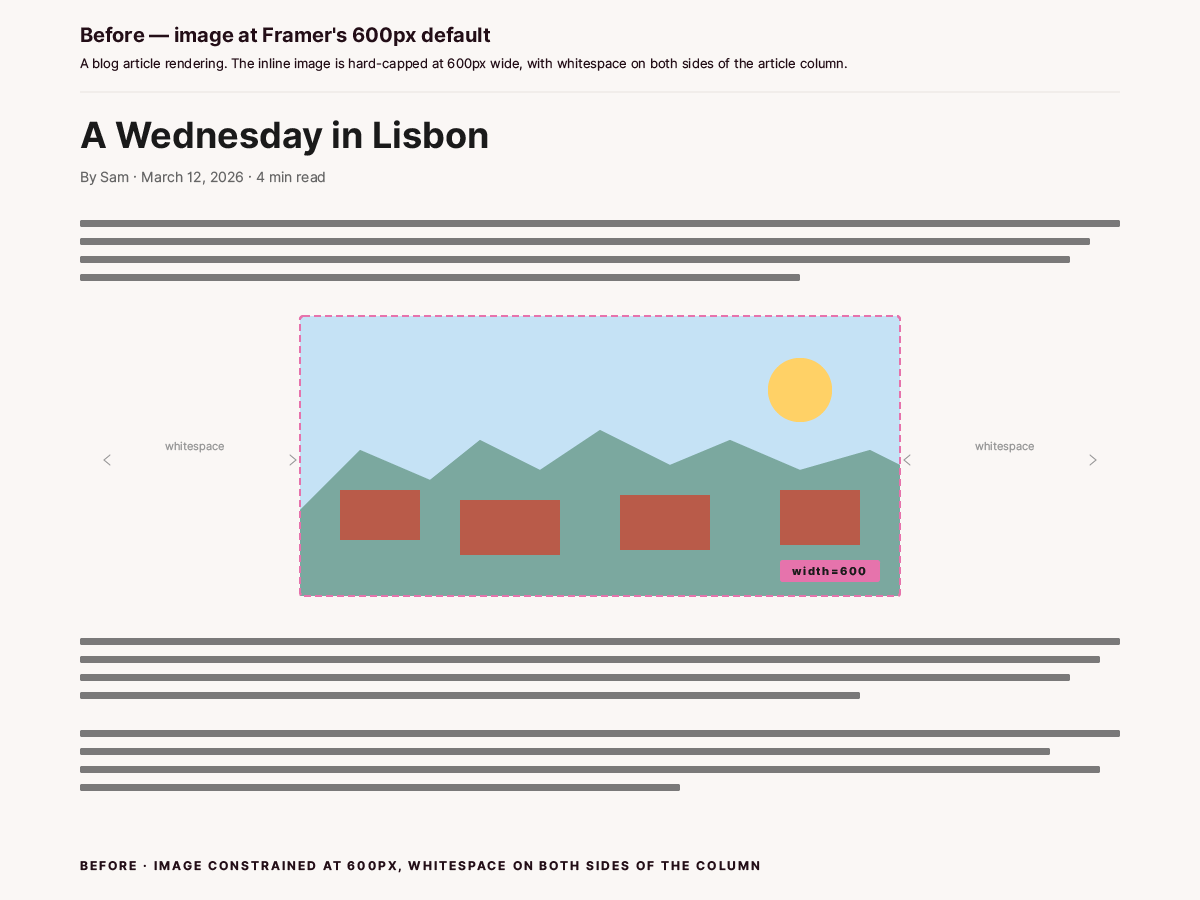
Before · Image at Framer's 600px default
Why Framer does this
Framer doesn't publish a rationale for the 600px attribute, but the most plausible reason is overflow prevention. Image components in Framer's visual editor sit inside parent containers with their own constraints. By writing a numeric width on every CMS-rendered image, Framer guarantees the image won't overflow a container with a smaller natural width than the source asset. The 600px figure reads as a sensible default for the kind of templates Framer ships out of the box, and it remains the platform's behavior.
The implication for content authors is that every article inherits the same 600px constraint, regardless of how wide the article template was designed to be. CSS in the template head is the cleanest place to set the right width for your design.
Who hits this
Anyone publishing content into a Framer CMS collection where the body field is rich text or markdown and contains inline images. Typical setups that trigger the 600px default:
CSV bulk import where one column carries the article body (Framer downloads any markdown-referenced images into its asset CDN and renders them inline).
Manual paste of markdown into the rich-text editor, with inline image syntax referencing Framer-hosted or external URLs.
Migration from another CMS (Webflow, Ghost, Notion, contentful) where the imported body markdown carried inline figures.
Manual placement of images in the rich-text editor using Framer's
+insert menu (the in-editor picker also produces an<img>withwidth="600").
If your collection only uses dedicated image fields (one cover per article, displayed via a separate Framer image component), you won't see this. The constraint applies to images that render inline inside the body, not to images bound to a typed field at the template level.
What this solves
Inline images render at the full width of the article's content column on desktop.
The CSS override applies template-wide. One paste in the CMS detail page custom code covers every article in the collection forever.
Future articles inherit the fix automatically. No per-article action needed at import time.
Figure captions can be styled in the same custom-code block: centered, smaller than body text, sitting close to the image, visually distinct from regular paragraphs.
The override is purely CSS. No JavaScript, no Framer plugin, no design-side changes to the rich-text component itself.
What this doesn't solve
Aspect ratios of the source images. If you exported a figure at 1200×400, the rendered figure will be wide and short. The CSS scales width to fit the column; height scales proportionally. The decision of what dimensions to export at remains yours.
Images embedded via Framer's separate image components on landing pages, marketing pages, or anywhere outside the CMS detail template. Those have their own constraints set in the visual editor.
The
width="600"HTML attribute itself. The CSS overrides the attribute's rendering, but the attribute stays in the source markup. View-source will still showwidth="600"; computed styles in DevTools will show your override winning.Lazy loading or decoding behavior. Framer also sets
loading="lazy"anddecoding="async"on inline images. Both are fine defaults and we leave them alone.
Prerequisites
A Framer project with a CMS collection (Articles, Posts, Manuals, whatever you've named it).
A detail page template bound to that collection, with at least one CMS-driven body field that renders inline images.
Access to the CMS detail page settings in Framer (the gear icon on the detail page in the project tree).
One inline image in a test article so you can confirm the override works. The test article doesn't need to be live; preview mode is enough.
Step 1: Open the CMS detail page custom code
In Framer, go to the project tree and locate the CMS detail page for your collection. The detail page is the template that renders one CMS entry per visit (/manuals/[slug] or /blog/[slug]), not the index page that lists multiple entries.
Click the detail page in the tree. With the page selected, open the right sidebar's Page Settings (sometimes the gear icon, sometimes a tab labeled Settings, depending on Framer version). Scroll to the Custom Code section. By default you'll see two boxes; click Show Advanced to reveal all four:
Start of
<head>. Runs before any content on the page. CSS belongs here.End of
<head>. Same lifecycle as Start of head, useful when load order matters.Start of
<body>. Runs before the rendered DOM. Mostly used for tracking pixels.End of
<body>. Runs after the DOM is parsed. JS that needs the DOM ready belongs here.
For this fix, paste into Start of <head>. Full reference: Framer's official guide to custom code covers all four slots and per-page scoping.
Step 2: Paste the image-width override
The CSS below has two rules. The first overrides Framer's width="600" on every inline image. The second styles italic-only paragraphs as figure captions. Copy the whole block:
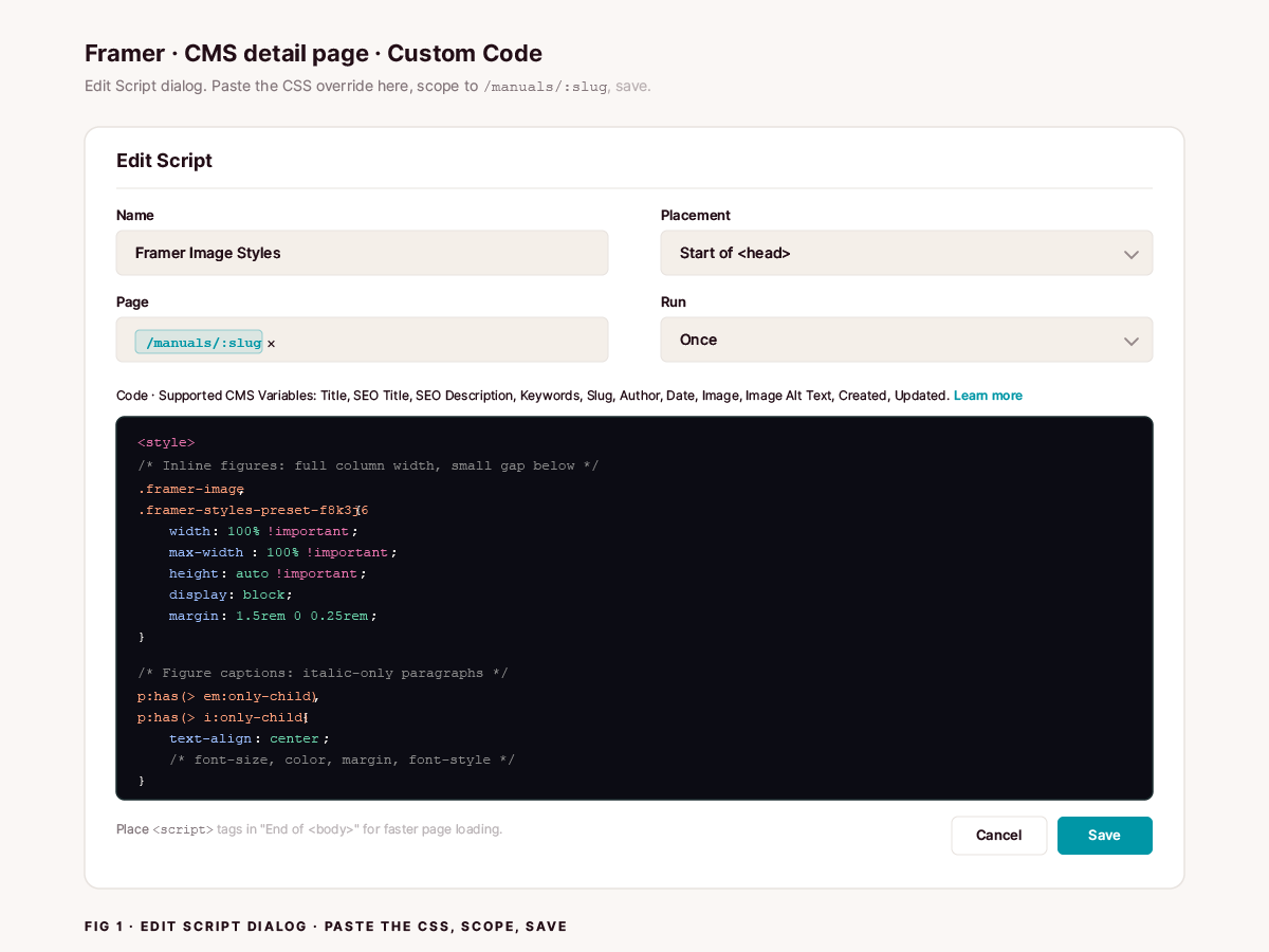
Fig 1 · Edit Script dialog · Paste the CSS, scope to /manuals/:slug, save
What each rule does:
.framer-imagematches every<img>element Framer wraps in its image component. The class is stable across versions.width: 100% !importantandmax-width: 100% !importanttogether beat the inlinewidth="600"HTML attribute. The reason is CSS specificity: presentational HTML attributes likewidth="600"are treated as author-stylesheet rules with specificity 0 and are not marked important, so any!importantauthor declaration outranks them.height: auto !importantensures the image scales proportionally.display: blockremoves the inline-image whitespace beneath the figure that browsers insert by default..framer-styles-preset-f8k3j6is a Framer style preset class added alongside.framer-image. The hash (f8k3j6in the example) is generated by Framer's design compiler and may change if you regenerate the design or tweak the style preset. Including it in the selector is belt-and-braces;.framer-imagealone usually suffices. If your project's preset hash differs, copy yours from DevTools and add it to the selector list. We'll cover that in Step 4.margin: 1.5rem 0 0.25remgives the image generous space above (1.5rem) and a small gap below (0.25rem) so the caption sits close to the image instead of floating midway between figure and next paragraph.p:has(> em:only-child)matches<p>elements whose only child is an<em>(italic). The pattern targets exactly the markdown lines that are pure italic (*Fig 1 · ...*). Other paragraphs that happen to contain italic words inline are not affected because the selector requires the<em>to be the only child of the paragraph. The:has()pseudo-class is supported in every current browser (Safari and iOS Safari 15.4+, Chrome 105+, Firefox 121+, Edge 105+). MDN tracks the compatibility table live.text-align: center,font-size: 0.95em,color: rgba(35, 14, 23, 0.6)style the caption as a centered, slightly smaller, muted line of text. The color valuergba(35, 14, 23, 0.6)is the brand dark text (#230e17) at 60% opacity. Adjust to whatever your brand text color is.margin: 0.25rem 0 2.5remkeeps the caption close to the image (0.25rem above) and gives the next paragraph breathing room (2.5rem below).
Step 3: Publish and verify
Save the custom code change. In Framer, publishing the page or template is what pushes the CSS to the live site. The preview environment usually picks up the change immediately; the published version may take a few seconds.
Open the live or preview URL for an article that has an inline image. Hard-refresh with ⌘+Shift+R (or Ctrl+Shift+R on Windows/Linux) to bypass any cached CSS.
Visually you should see the image fill the column. To confirm with DevTools:
Right-click an inline image, choose Inspect.
In the Elements panel, locate the
<img class="framer-image ...">tag.Switch to the Computed tab.
Find the
widthproperty in the computed styles list. The value should now match the article's content-column width in pixels (something like 720px or 800px), not 600px.Switch to the Styles tab. You should see your
.framer-image { width: 100% !important; ... }rule listed at the top. Underneath, thewidth="600"HTML attribute should appear in a struck-through line, indicating it was overridden.
If the rule is winning, you're done. If the width is still 600px, see Troubleshooting below.
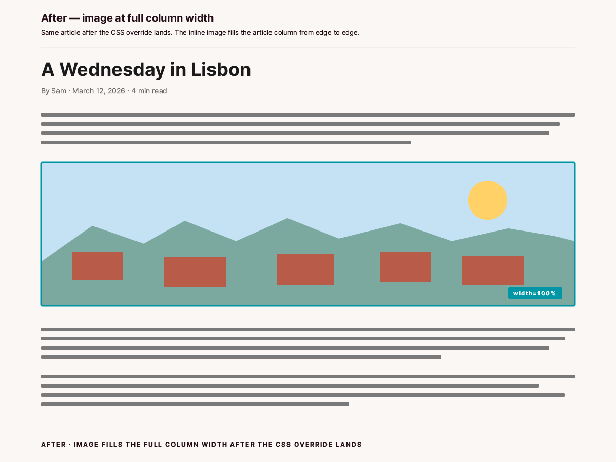
After · Image at full column width once the CSS override lands
Step 4: Find your actual preset class (if needed)
The framer-styles-preset-f8k3j6 selector in the CSS above is a generic example. Your project's preset class will have a different hash. The hash is generated by Framer's compiler based on the project's style-preset configuration. If you ever regenerate the design or modify the article's body text preset, the hash changes.
To find your preset class:
Inspect an inline image in DevTools.
In the Elements panel, look at the
classattribute on the<img>tag. You'll see something likeclass="framer-image framer-styles-preset-xyzABC ...".Copy the
framer-styles-preset-...class verbatim, including the hash.Replace
framer-styles-preset-f8k3j6in the CSS above with your actual class.
This is optional. The .framer-image selector is enough to win against width="600" in most cases. Including the preset class is a belt-and-braces backup that adds CSS specificity if a future Framer update introduces a more aggressive preset rule.
Adapting beyond rich-text inline images
The same CSS pattern adapts to a few related scenarios.
Cover images on the CMS detail page. If your detail template renders a cover image at the top via a typed Image field, Framer applies the same framer-image class to it. Your override will affect the cover too. In most cases that's what you want (covers usually look better at full width than 600px). If you have a template that intentionally caps the cover at a specific width and want to keep that, scope the rule to a parent container that only wraps the body content, like .article-body .framer-image. Inspect to find the parent class.
Images on landing pages or non-CMS pages. The framer-image class is also used on images placed via the visual editor on regular pages. If you don't want the override to affect those, put the CSS in the CMS detail page custom code, not the site-wide custom code. The custom code section in Page Settings is scoped to that page (and its instances per CMS entry).
Multiple CMS collections sharing the same fix. If you have separate detail templates for Manuals, Insights, and Case Studies, paste the same CSS into each detail page's custom code. There's no global "CMS detail" hook. The custom code is per-template.
Galleries or grids of images. If your body content uses a custom CMS field that renders multiple images in a grid, the framer-image class still applies to each image. The width: 100% !important rule will make each grid cell's image fill its cell, which is typically what you want. If you need grid cells with explicit fixed widths, scope the rule with a parent selector.
Edge cases worth knowing
:has() browser support. The :has() selector for the caption rule needs a current browser. Safari (desktop and iOS) 15.4 added support in March 2022; Chrome and Edge added it in version 105 in August 2022; Firefox added it in version 121 in December 2023. Internet Explorer and legacy Edge never supported it and never will. Your traffic share on browsers older than the supported versions is probably under 1%. For unsupported browsers, the captions render as left-aligned italic body text. The articles still read fine; the only loss is the centered caption styling.
Server-side rendering vs hydration. Framer renders the page server-side and hydrates with React on the client. The width="600" attribute is present in both the SSR output and the hydrated DOM. The CSS override works in both because it's pure CSS that runs as soon as the stylesheet is parsed. No flash of unstyled content.
The hash in framer-styles-preset-XXXXXX can change after design tweaks. If you edit the body text preset (font size, line height, color) in the design panel, Framer regenerates the preset class with a new hash. Your existing CSS rule still works because .framer-image is stable, but the second selector (framer-styles-preset-XXXXXX) becomes obsolete. Re-inspect, copy the new class, update the rule. Or rely on .framer-image alone and skip the preset class entirely.
Existing CMS articles already published. The CSS applies to all articles in the collection, past and future. You don't need to re-import existing articles to make their inline images bigger. Publish the custom code change and every existing article picks it up on the next page load.
Caching. Framer's asset CDN can serve cached versions for a short period after a publish. After publishing the CSS change, hard-refresh (⌘+Shift+R) any open article page to bypass the cache. If the change still isn't visible after a hard refresh, check Site Settings → Optimization for any custom-code injection rules or CDN cache settings that might extend the duration. The custom code itself shouldn't be cached longer than the page HTML.
Troubleshooting
The CSS is in the custom code but the image still renders at 600px. Most likely the rule isn't matching the image's actual class. Inspect the <img> in DevTools and confirm the class is framer-image. If Framer renamed the class in a recent update, copy the new class name and update the selector. If the class matches, check that !important is present on both width and max-width. HTML attributes lose to CSS only when !important is used; without it, the cascade favors the inline HTML attribute.
The width changes but the image still looks small. Computed width is now the column width, but the rendered image visually is smaller than expected. Cause: the source image is smaller than the column. If your WebP is 600px wide natively, scaling it to 100% of an 800px column will look soft but won't make it bigger than its native resolution. Re-export the source at the column width or 2x the column width (for retina screens).
The caption rule isn't applying. Three possible causes. First, the browser doesn't support :has() (see the Edge cases section). Second, the caption paragraph isn't pure italic. Markdown produces <p><em>...</em></p> only when the entire line is wrapped in single asterisks (*caption*) with nothing else around it. If you have *caption* — extra text on the same line, the <em> won't be the only child and the rule won't match. Use a separate paragraph for the caption. Third, the caption paragraph has trailing whitespace or other invisible characters. Markdown can produce <p><em>...</em> </p> (note the trailing space text node), which breaks :only-child. Trim trailing whitespace.
The override breaks the cover image on the CMS detail page. The framer-image class is shared with the cover image. If your cover is supposed to be narrower than full-width, scope the rule to the body content container only. Inspect the body field's parent and add its class (commonly .rich-text or .framer-text-content or similar project-specific name) to the selector, e.g. .rich-text .framer-image.
The override breaks images on the homepage or other non-CMS pages. The CSS was pasted into site-wide custom code instead of the detail-page custom code. Move it from the site-level custom code into the CMS detail page's custom code so it scopes correctly.
The published site shows the fix but Framer's preview doesn't. Framer's preview iframe has its own stylesheet injection that can lag the published site by a few seconds. Publish the page, wait ten seconds, hard-refresh the preview.
An image inserted via the visual editor isn't matching. Framer's visual-editor image picker produces a slightly different markup tree than markdown-rendered inline images. The class is still framer-image, but the parent container differs. Inspect the actual element and confirm the rule applies. If the rule applies in DevTools but the image still renders small, look for another competing rule on a parent container that's constraining width below 100%.
Summary
Framer hardcodes
width="600"as an HTML attribute on every CMS-rendered inline<img>. It's not a setting and there's no in-editor override.One CSS rule in the CMS detail page's custom code overrides it:
.framer-image { width: 100% !important; max-width: 100% !important; height: auto !important; }.A second rule using
p:has(> em:only-child)styles italic-only paragraphs as figure captions: centered, smaller, muted, close to the image.The CSS applies template-wide. Every article in the collection inherits the fix automatically.
If your project's
framer-styles-preset-XXXXXXhash differs from the example, inspect an inline image and copy the actual class. Or skip the preset class and rely on.framer-imagealone.Verify with DevTools: computed width should match the column width; the inline
width="600"should appear struck through in the Styles panel.The pattern adapts to covers, grids, and other CMS image scenarios via parent-class scoping.
Related manuals
Your Framer Cookie Banner Looks Compliant. It Isn't. The other Framer-default-that-needs-a-fix in the same templates. Covers the GDPR consent gap and the GTM wiring that closes it.
Bloomreach Engagement Experiments on Framer: Async vs Sync Mode. Framer's loading-order quirk that breaks A/B tests on Framer-hosted sites. Sister manual for anyone running personalization on a Framer site.
How to Push New URLs to Bing and Yandex the Moment You Publish. Adjacent publishing-pipeline fix for Framer sites. Once your figures render at full width, the next thing you want is search engines to find the page.
Add Email Alerts to Your IndexNow Cloudflare Worker. Extension of the IndexNow setup above. Resend-backed push notification on every Worker run.


